

Home Assistant *Update*
For all my r/homeassistant folks

I posted a few items from our dashboards to r/homeassistant a couple of days ago and got a lot of questions about our setup, if dashboards are “ever really finished” (which, low and behold, I have tinkered so much with our dashboards since those posts that they are so right), and I have wanted to do a more in-depth write up on our setup.
Since I put in my three weeks’ notice back on 12/13/24 and this is the only day I’m working this week (without anything to actually do), today seemed like the perfect day to sit down and get this written.
As briefly outlined in my previous post regarding this topic, I started with Home Assistant running on our Synology NAS through the container manager but have since purchased a Home Assistant Green to achieve loads more functionality.
Dashboards
For starters, here is a breakdown of the dashboards I have set up. I’ll dive more in depth about them later.
Purpose
The primary goal of utilizing Home Assistant is to try and streamline all of our functions into one app. For a long time, we relied a lot of different apps for information…
Notion to track banking info, expenses, to-do’s, etc.
Copilot Money (K4BTK8) so my wife had a mobile means of viewing budgets (I still really like this app, but am slowly getting to where we can stop using it).
Various other sources for smart home devices such as Daikin, Dreo, Google Home, Kasa (TP), myQ, Rachio, etc.) I also really love the multiple integrations that aren’t directly tied to home automation that can make Home Assistant a very enjoyable and “one-stop shop” for us.
Future Projects
I have got to figure out a solid garage door opener method because myQ is the worst. I think we need to replace the controller/motor on our existing garage so I’m researching some options to help integration automations and alerts with Home Assistant. Currently evaluating Nice/Linear, ratgdo, and meross.
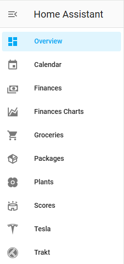
Overview
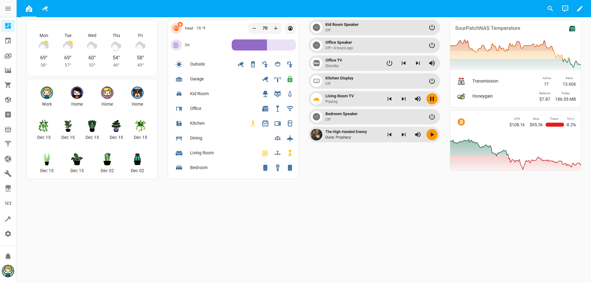
The main dashboard display is generally where I spend the most amount of time tinkering and trying to hone in on what’s the most relative “quick-glance” information I’d want. The trickiest part with this is getting it to display well for desktop/tablet view (how I primarily interact with it) and mobile view (how my wife solely interacts with it). I’ve removed a lot from this main dash to make it more digestible and easier to navigate in both places.
Weather
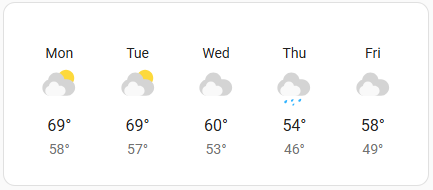
Nothing to elaborate on here. There are a lot of customizable weather cards and themes but I really like the simplicity of the native weather forecast card in Home Assistant.
Family + Plant Babies
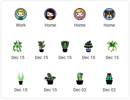
My wife and my locations are tied to Home Assistant mobile app and utilizes our phone as location indicator. From there, there’s a few zones set up for common places (Home, Work, School, Gym, Church, Target - lol). For my daughter’s location, since she doesn’t have a phone, I’m using a combination of time automations to trigger her location as “School” if my wife or I arrive to here school zone in a certain time range, triggers her location to mimic our location if one of us picks her up from school, and some other ways that trigger additional locations. She’s generally with us in some capacity so this wasn’t super necessary, but I’m a completest and wanted her included in the dashboard.
For our pup, this one was sort of a bear. His collar has an AirTag attached to it, but AirTags “share” their location by sending Bluetooth signals to other Bluetooth devices in our Find My account and then relays that information up to iCloud that then appears in the Items display. I came across this project and after messing with it a lot was able to get it to work. In short, it’s a workaround of running an automation on iPhone (mine runs daily) that opens Find My, screenshots, parses text in said screenshot, sends that text to input.text entity within HA, and updates the sensor templated off the input.text entity.
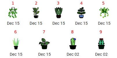
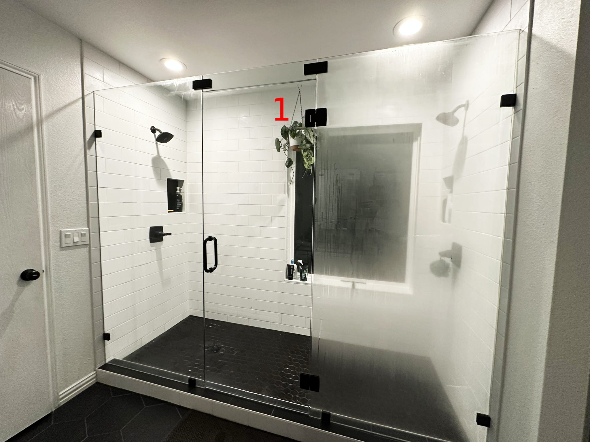
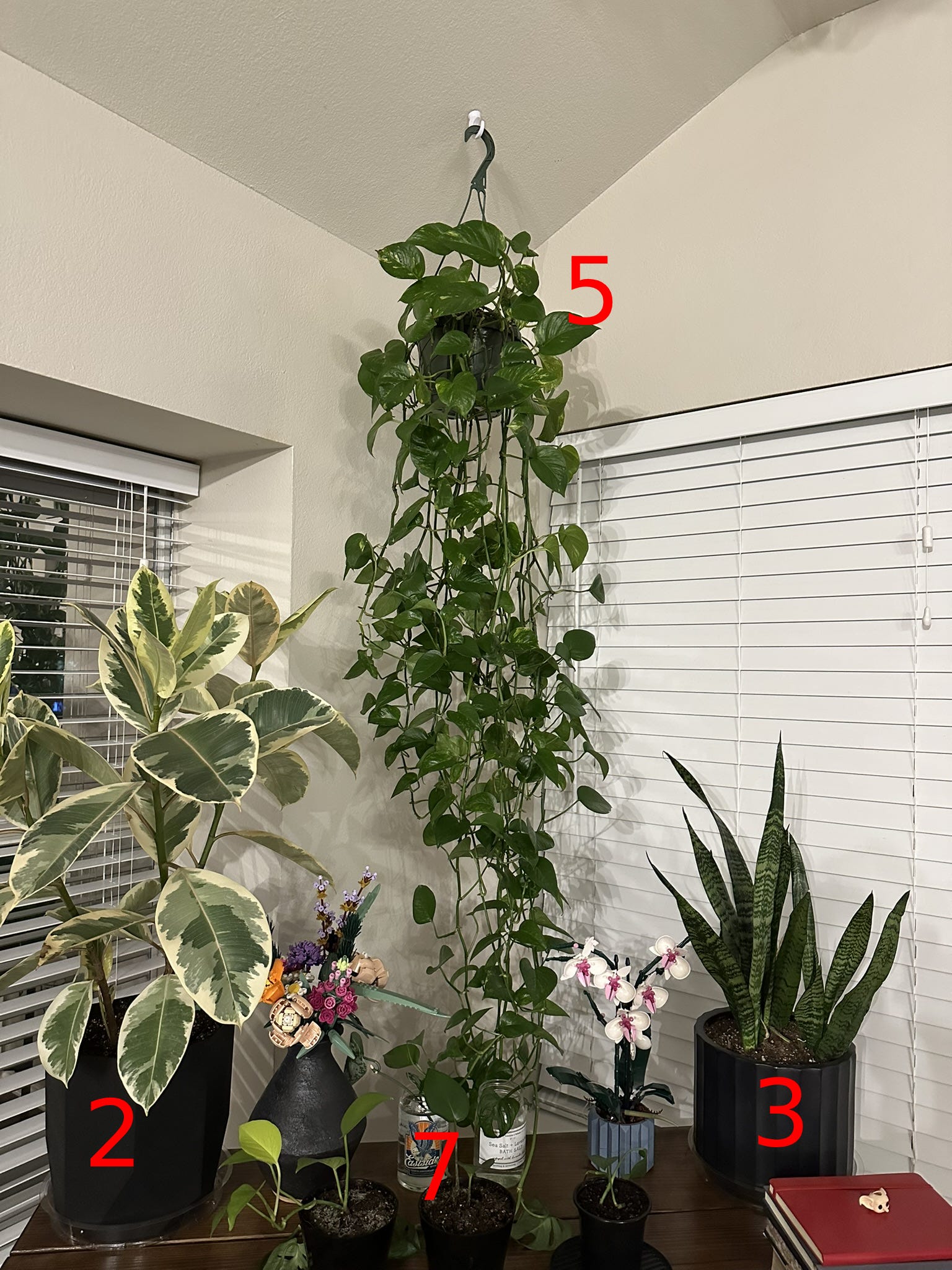
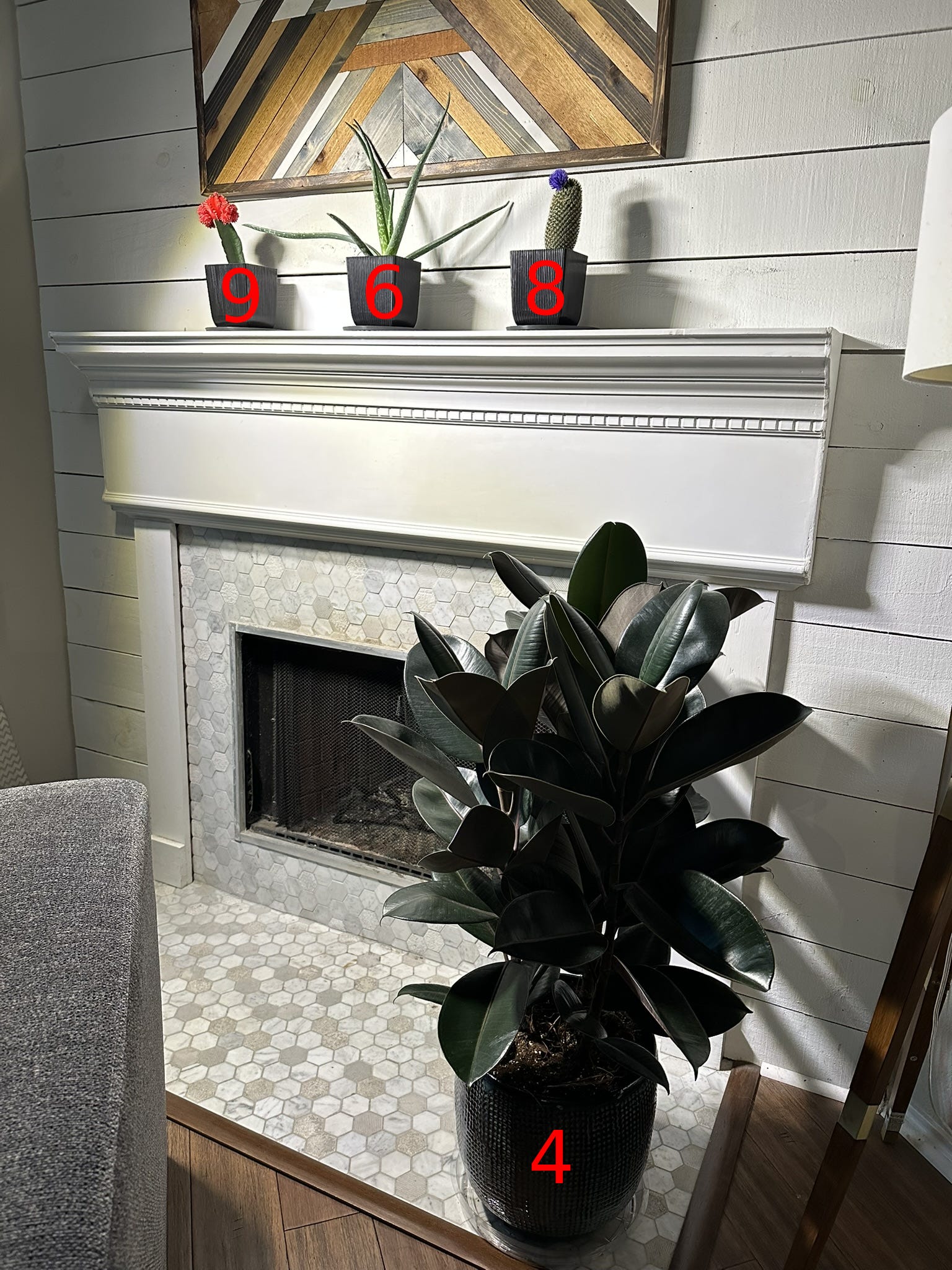
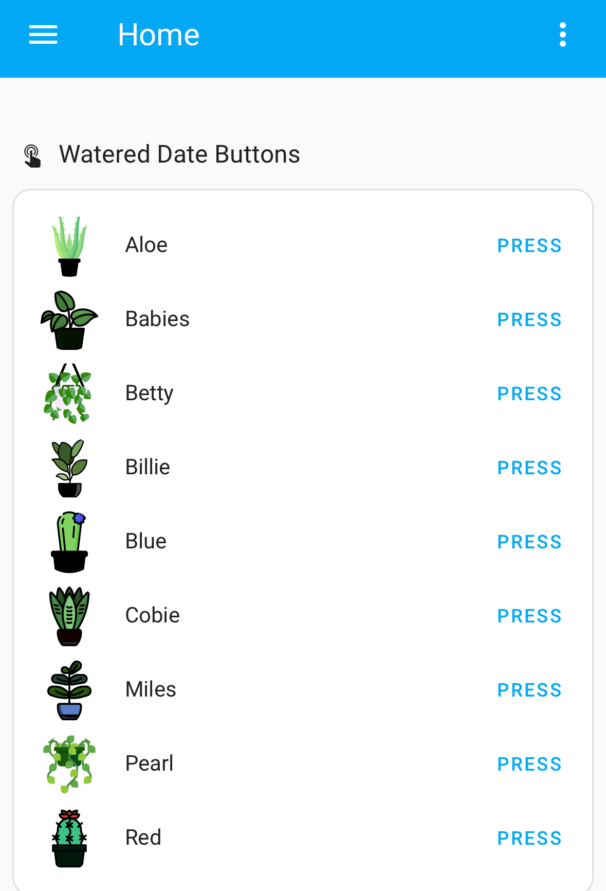
For the plants, this has been the most requested/popular when I have posted previously. The use case is very simple for the most part, and as I have mentioned before, the most time consuming part was creating icons that looked like our actual plants. Necessary? No. Adorable? Yes.
The dates displayed are triggered off some buttons I made for us that input the date pressed (we use this for date last watered). An automation will run off that date when a certain # of days has passed to let us know to water (or at least check the moisture level). There are also automations to notify us for fertilizing dates but since that’s much less frequent I don’t have glance cards with the dates.
Home Devices
This one has been my biggest time suck most recently. I came across the multiple-entity-row element for the native entities card and it’s been really clean.
Each area button triggers an automation or function (Kid Room toggles on/off all lights, each individual button toggles on/off). Most of the devices are toggling on and off lights, but some provide pop ups to view cameras (front yard and doorbell, for example). Also very pleased with this one since it shortens the entities drastically while retaining the functionality which is super helpful for mobile usage.
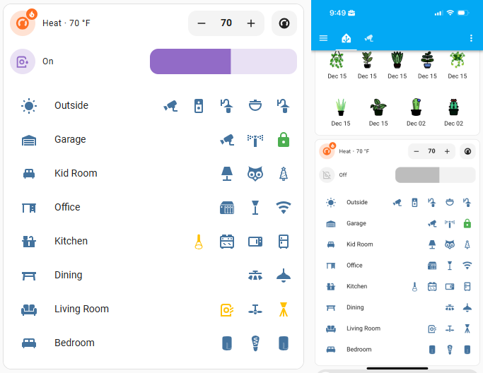
Updated: 12/30/24
Purchased the Meross MSG100 and am so far happy with it. Icons will display state (closed, open, opening, closing) but need to see how well it works with automations.
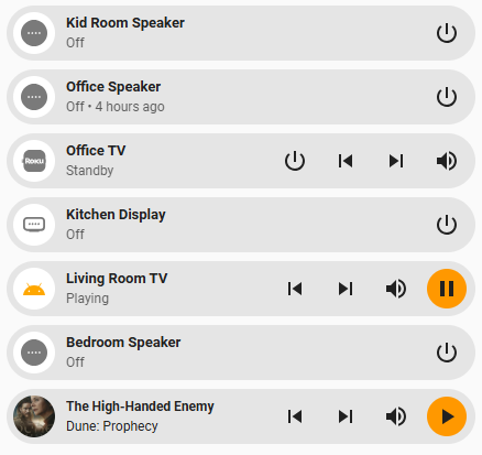
Media Controls
This one is still somewhat a work in project. I’m utilizing the bubble-card and don’t think I have even scratched the surface for what this can do yet. Really excited to dive more into this one and see what I can come up with.
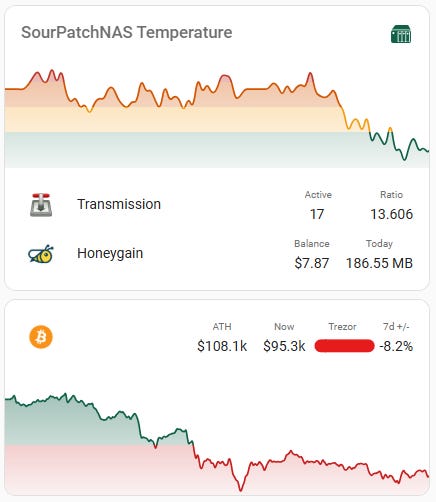
NAS & Bitcoin
The charts I’m using below are from the mini-graph-card (which is hands down my favorite card I have found). It’s super customizable and relatively easy to use. One of my favorite features is being able to “code” transition points based on states or numbers. For Bitcoin, as an example, >$100k is green and <$100k red. I’m also combining the charts here with a multiple-entity-row card using the vertical-stack-in-card. There’s also a sensor calculating the price of Bitcoin multiplied by our cold storage amount to get the USD value for the Trezor info below.
Security Cameras
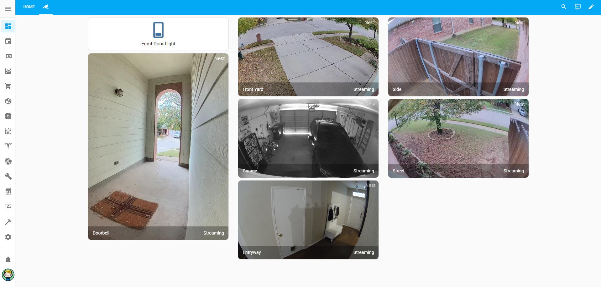
Pipe dream is to get entirely off of Google Nest’s cameras and API functions and utilize cameras with Home Assistant and store clips locally to our NAS.
Finances
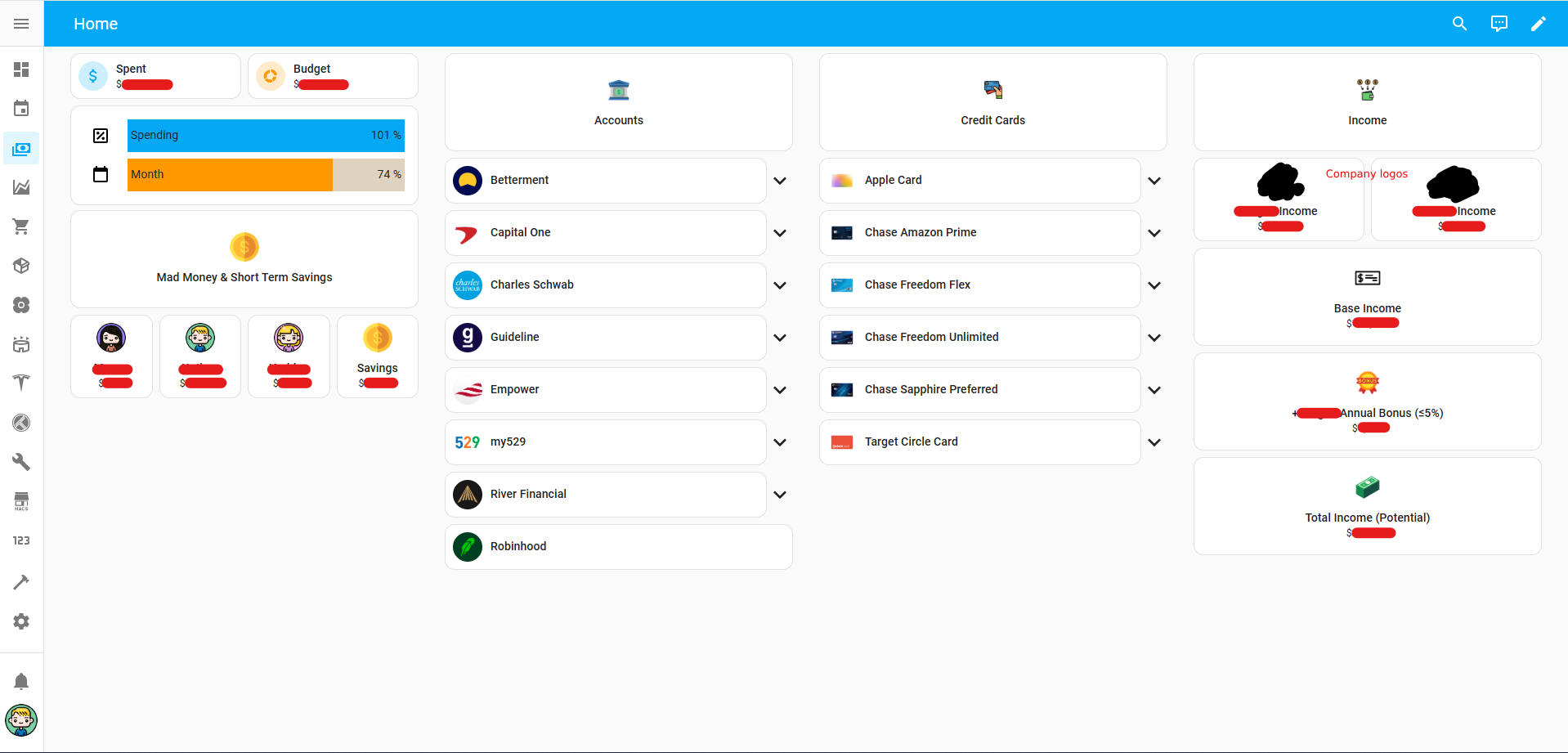
This is one of the ones that took me the longest and was entirely and completely unnecessary (customizations at least). In Notion I had this set up so that my wife could see what credit cards we have and where to use them, what banks or investment firms we have and what they’re used for, what’s contributed, what’s matched, etc., and information about income. All of this information except for the dropdown items are now being automatically fed from Excel using VBA.
Spent & Budget are pulled from Excel, and that data is also used for automations in Home Assistant to create a “run rate tracking” display of % of spending vs. budgeted and % of month passed so far (December always cooks us between holidays and multiple birthdays 🙄)
Mad Money (“fun money”) and Short Term Savings also feed from Excel automatically.
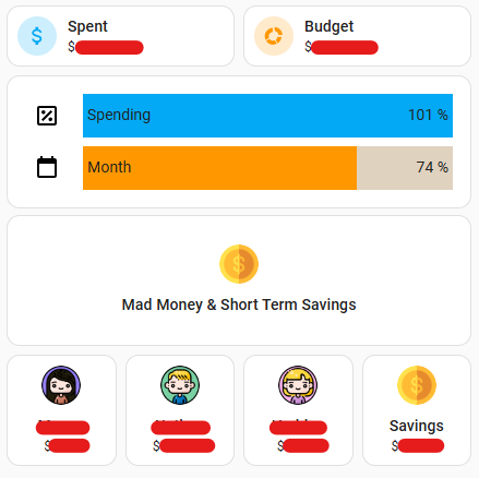
Accounts & Credit Cards is where I spent too much time making custom icons to show everything but it was fun and makes a visually appealing version to catalog our bills/expenses.
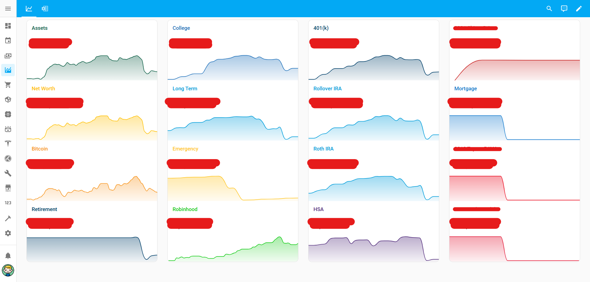
Financial Charts
This one is still somewhat a work in process. My end goal is to be able to trend multiple months, but I don’t want to go through the trouble of loading in historical values. I’m tied to the timeframe in which the sensor was created within Home Assistant. For example, “Retirement” is a new sensor, even though all of the entities feeding into summing that are not, so it’s “flat” for like 28 days and then variability for the next 2-3. Over time all of the charts will look more like charts (at least I’m hoping). For the right column which is just the value of our home, cars, and our mortgage, there’s not nearly enough data for those to be charts worth anything since that data doesn’t change often at all. The home value is being pulled in automatically from a Redfin integration. When the state of that value changes, an automation runs to input the numerical value into the sensor I made for the property automatically.
Instead of using the Redfin integration’s sensor as the data for the chart, I’m using the input.number value feeding from Redfin because Redfin has broken a few times and it really skews the data. Initially the charts shown below were being input manually but I have since tested out the Excel data feeding directly into Home Assistant and have new charts off that data. However, there’s only a week of data so I’m not using that as my “display” chart until more data is filled. (That’s the Excel icon in top left next to the graph icon).
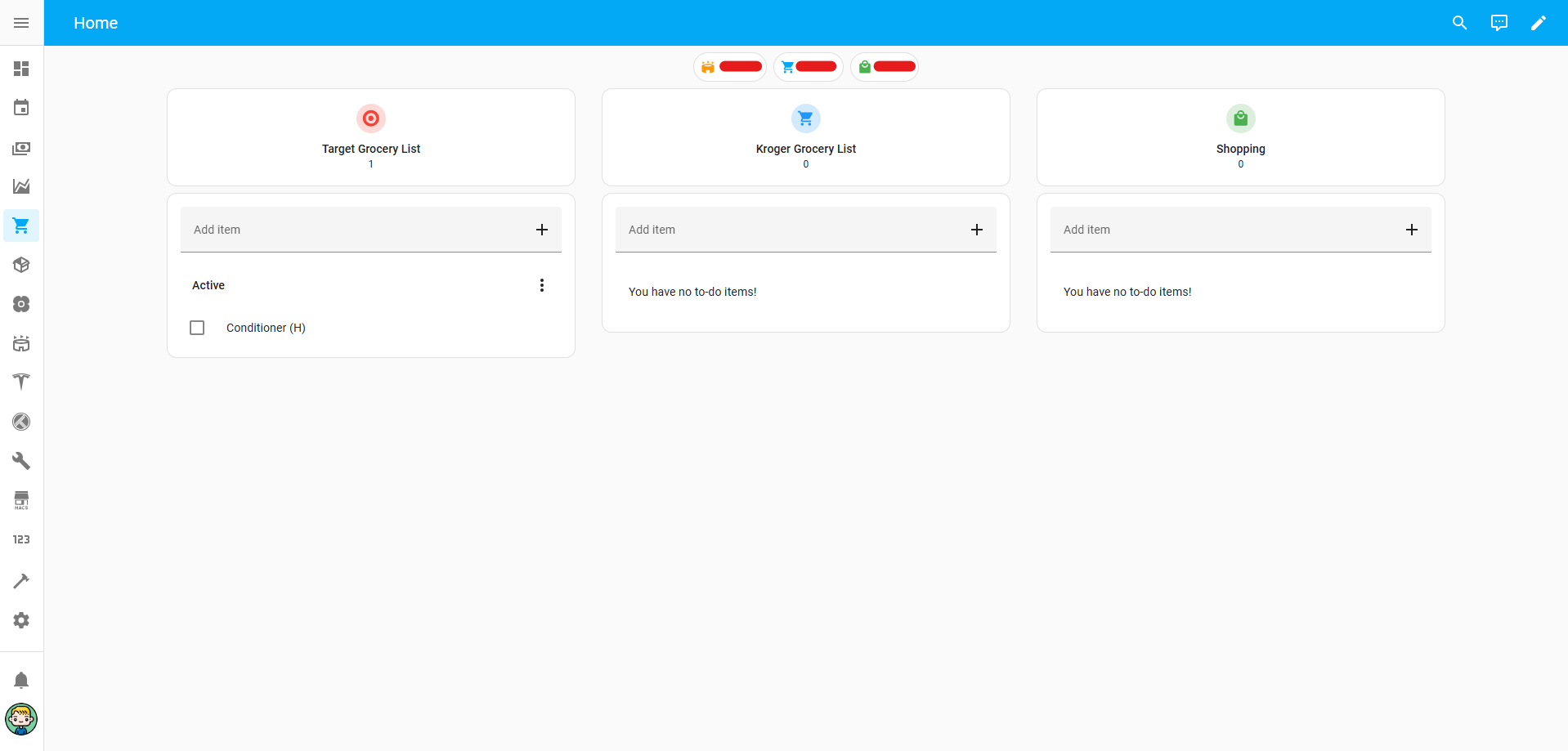
Grocery & Shopping Lists
This was one of the bigger ones needed when coming off of Notion since we used this religiously. I noticed a lot of syncing issues and updating was laggy with Notion so over time I started to really dislike it.
This also pulls in what’s remaining in our Entertainment, Groceries, and Shopping budgets for the month (automatically from Excel) so that my wife has a quick means of seeing that without having to open up Excel or Copilot (which has delays on data updates specifically with Target).
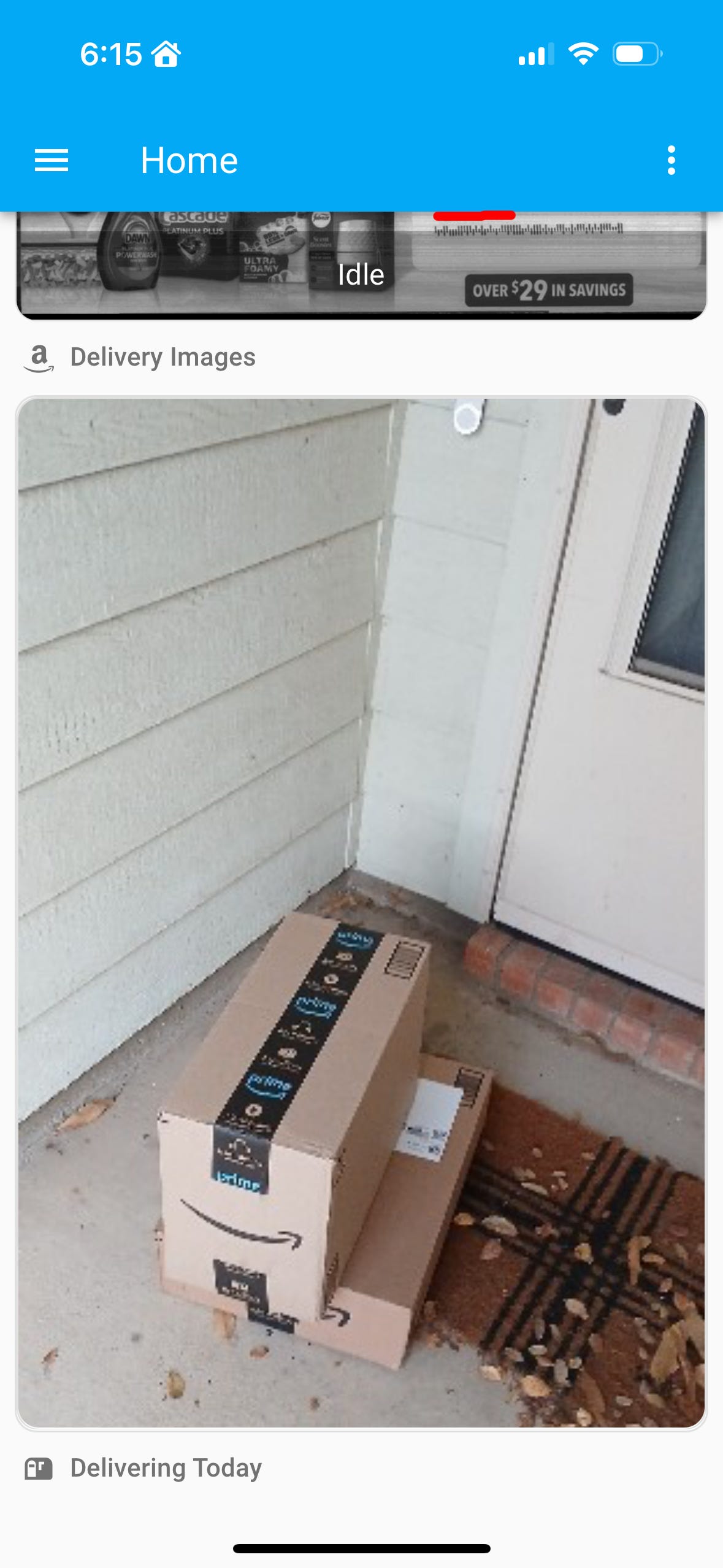
Packages
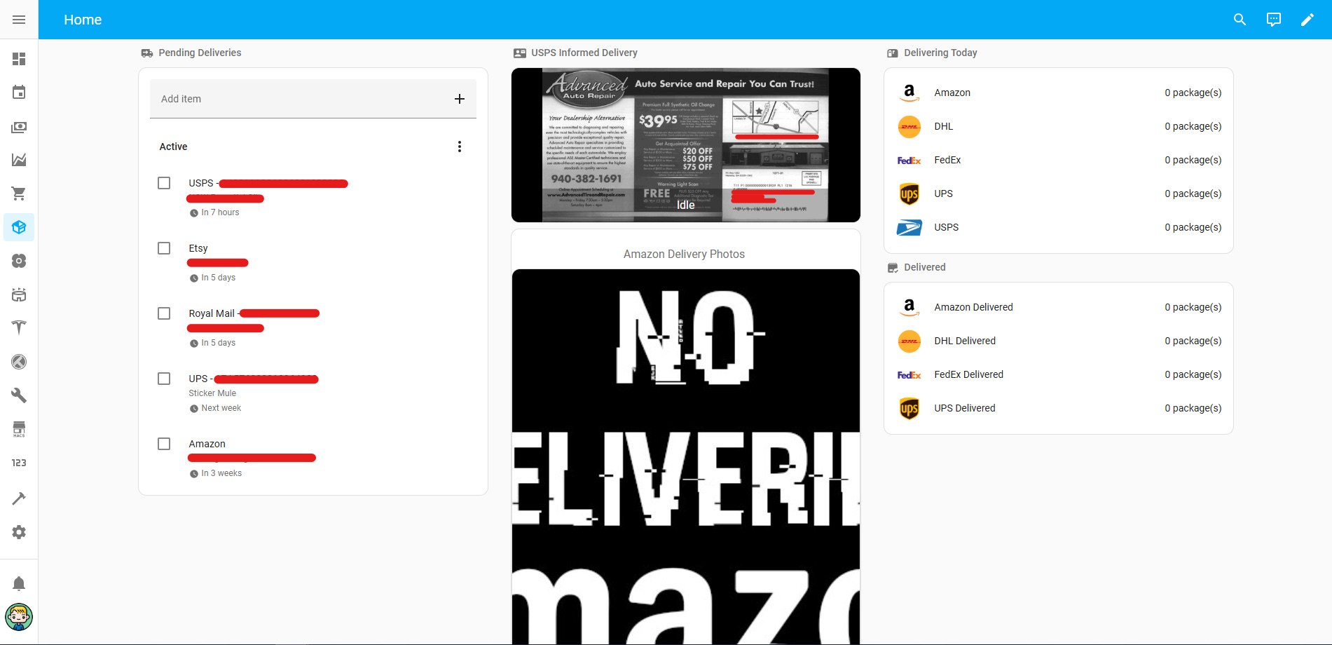
This is another thing I was able to pull out of Notion and add some additional functionality to. The left column is just a means of keeping a list of stuff coming in with their tracking numbers so we can ensure nothing gets lost.
The middle column are camera entities built off integrations with the mail and packages integration with Home Assistant. This scrubs an email inbox I have forwarding rules set up for to pull in the actual scans from USPS Informed Delivery and Amazon delivery photos.
The right column grabs some of that same information and updates accurately. I’m relatively pleased with this dash. I have some visibility rules set up for the camera entities to only show if there’s something to show (state-based rule), but removed that for displaying how it looks here.
Updated: 12/29/24
Plants
This is a newer one thanks to a recommendation on Reddit. This was a simple one of just creating buttons that input the date the plant was last watered. I spoke about this one previously. Automations then run off those input dates if a certain number of days have passed to notify us to water or check the moisture of the plants.
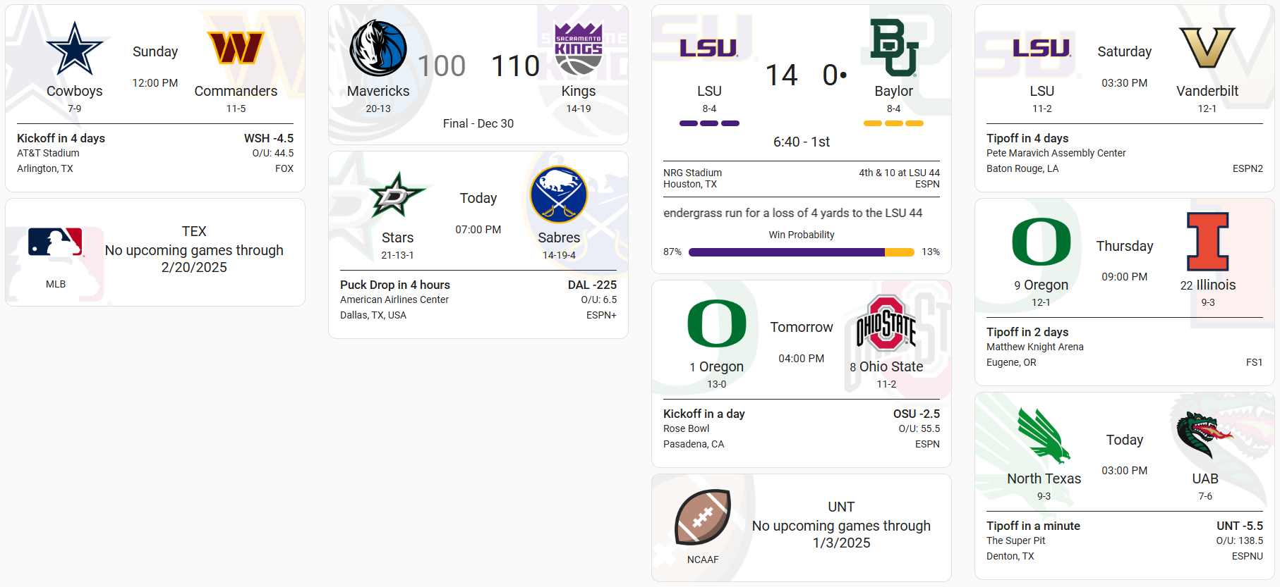
Scores
Honestly, I will probably delete this one. I do like the display and the information that shows during a game is really cool, but ESPN or CBS have cleaner apps if I wanted to check scores. The caveat there is that ESPN and CBS are also loaded with lots of other teams I don’t care about and tons of adds/videos, so this is a decent “quick glance” look.
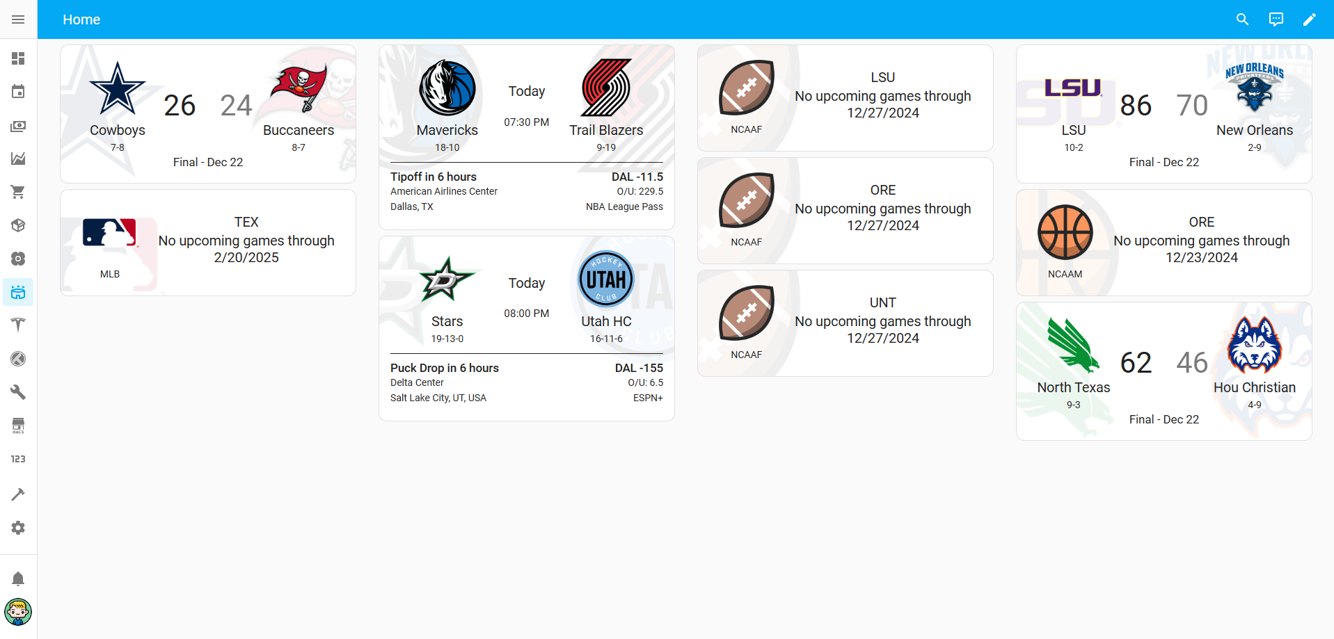
Updated 12/31/24
Showing “in-game look”
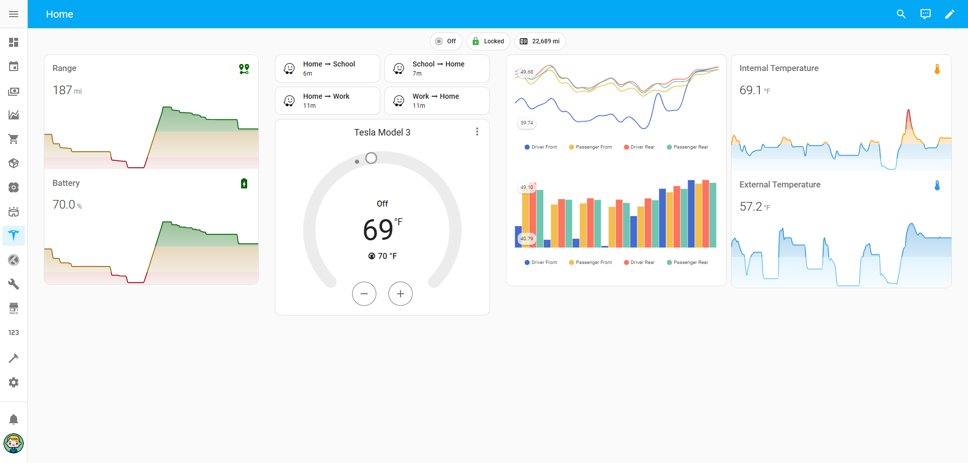
Vehicle Info
This has become relatively useful. It’s definitely the most useful because I can tie automations to certain states from the vehicle’s entities. The psi does have somewhat of a shortcoming because it’s not constantly reading. So the data is always going to be reading off when the car was last turned off so I’m getting hot air readings.
I put my tires to 45psi in the winter and 42psi in the summer. By the end of my commute the tires are probably closer to 50psi and that’s what gets reported since that’s when the car is turned off. I’m still playing with this, but it did help me figure out I had a slow leak and find a hidden nail in my tire this past weekend.
Some of the other integrations displayed here are transit times for regular drives, odometer, car locked/unlocked status, and sentry mode on/off toggle.

Trakt
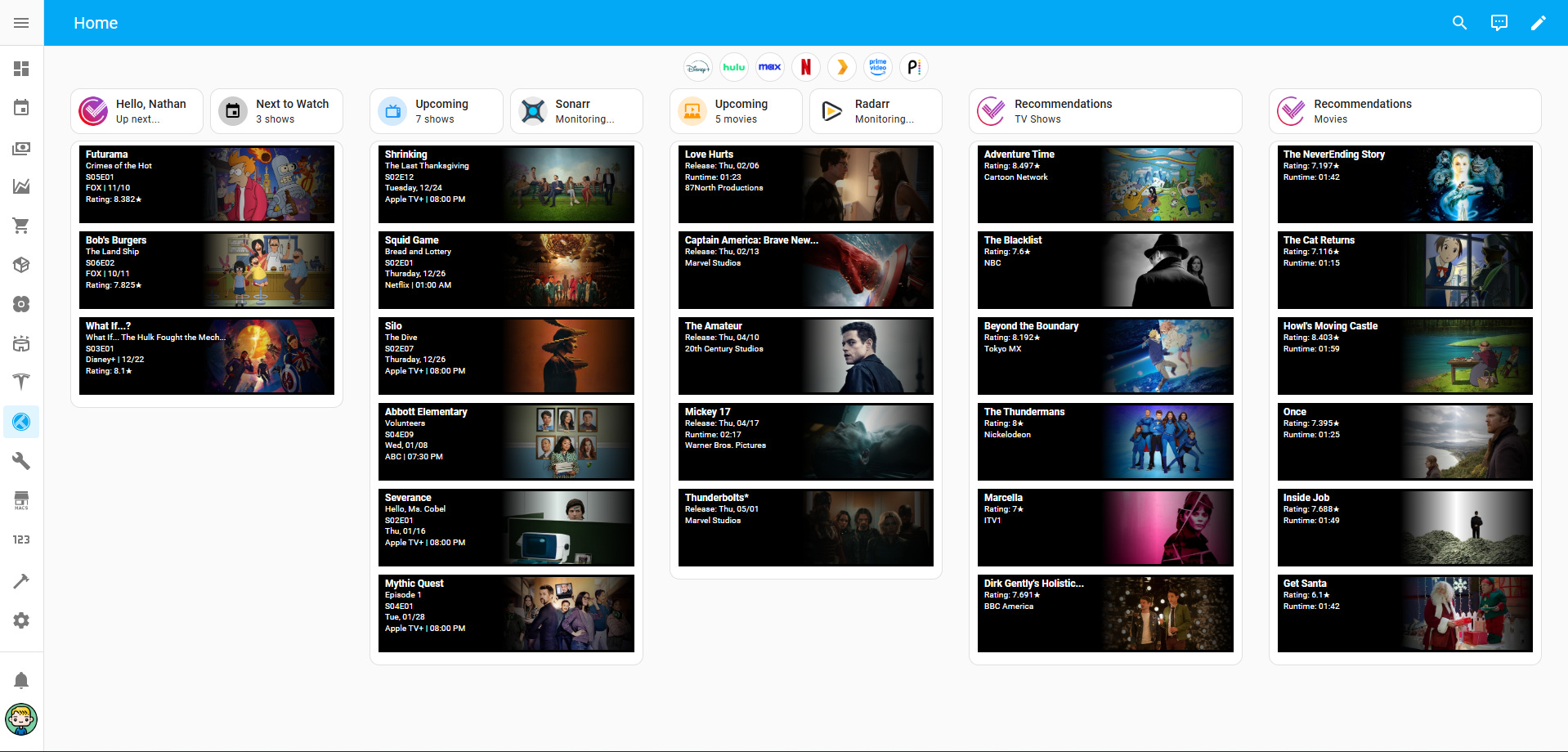
I switched over to using Trakt (from Letterboxd and JustWatch) recently and I’m really happy with the integrations and API’s they have available. I’m able to have my profile scrubbed to get some really cool data. Trakt is wonderful but sometimes the UI is super busy/over-stimulating so this is a cleaner way for me to see some relative information.
Each streaming button up top navigates to those streamers (or my Plex server).
“Hello, Nathan…” navigates to my Trakt Dashboard
“Next to Watch” navigates to the watching progress/next up
“Upcoming” navigates to Trakt’s calendar for shows I’m following
“Sonarr” navigates to my Sonarr instance (running on our NAS)
“Upcoming” navigates to Trakt’s calendar for movies I’ve watchlisted
“Radarr” navigates to my Radarr instance (running on our NAS)
Recommendations (TV Shows & Movies) navigate to those areas within Trakt
The movies and shows below each column can be formatted individually to show titles, dates, ratings, etc.
Example yaml config:
type: custom:upcoming-media-card
entity: sensor.trakt_next_to_watch_all
enable_transparency: true
date: mmddyyyy
clock: 12
max: 6
image_style: fanart
box_shadows: false
border_color: null
hide_empty: false
title_text: $title
title_size: medium
line1_text: $episode
line1_size: small
line2_text: $number
line2_size: small
line3_text: $studio | $date
line3_size: small
line4_text: Rating: $rating★
Hopefully this was somewhat informative. If you have any questions or want additional yaml configs I am using, let me know!
Merry Christmas!
Fantastic writeup, thanks for some ideas to add to my own dashboarding!